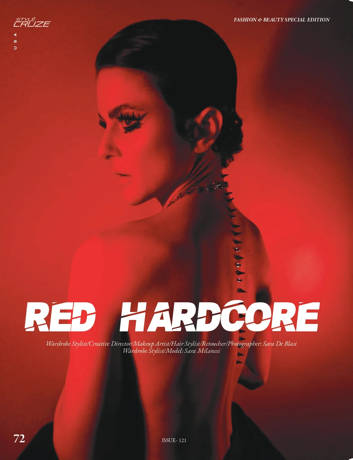
RED HARDCORE
RED IS NOT AN ACCENT. IT BECOMES MATTER.
A beauty editorial where colour becomes skin, atmosphere and narrative — intensity, tension and emotional weight across the entire image.
Creative DirectionBeauty & HairPhotographyRetouchStyleCruze USA · Fashion & Beauty Special Edition · June 2026 · Issue Vol. 1212026
Palette read
- Signal Red #F12616
- Void #080808
- Bone #F2F0EA
- Skin #C79C82
The Case
- Context
A project developed around strong emotional states and a deliberately visceral colour language.
To create images that feel polished and controlled, while introducing elements that remain slightly disturbing, physical and unresolved.
- Direction
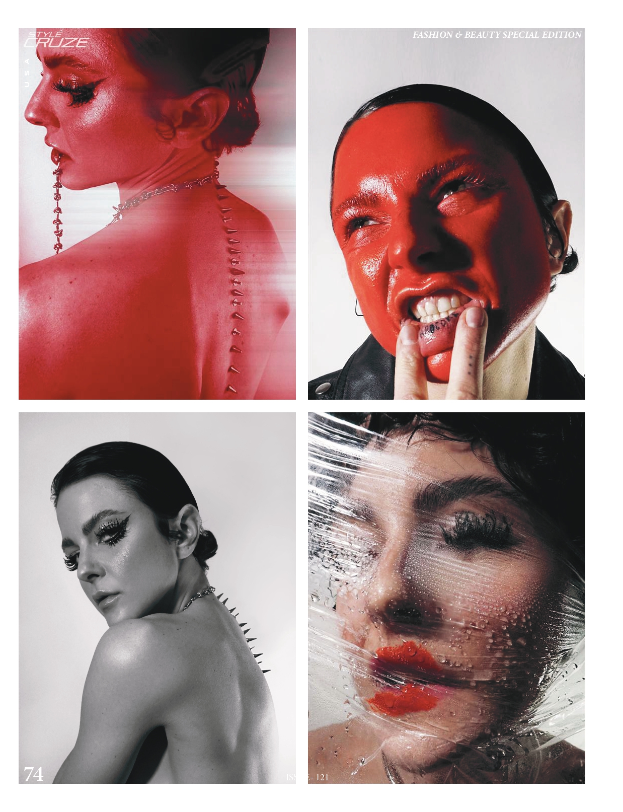
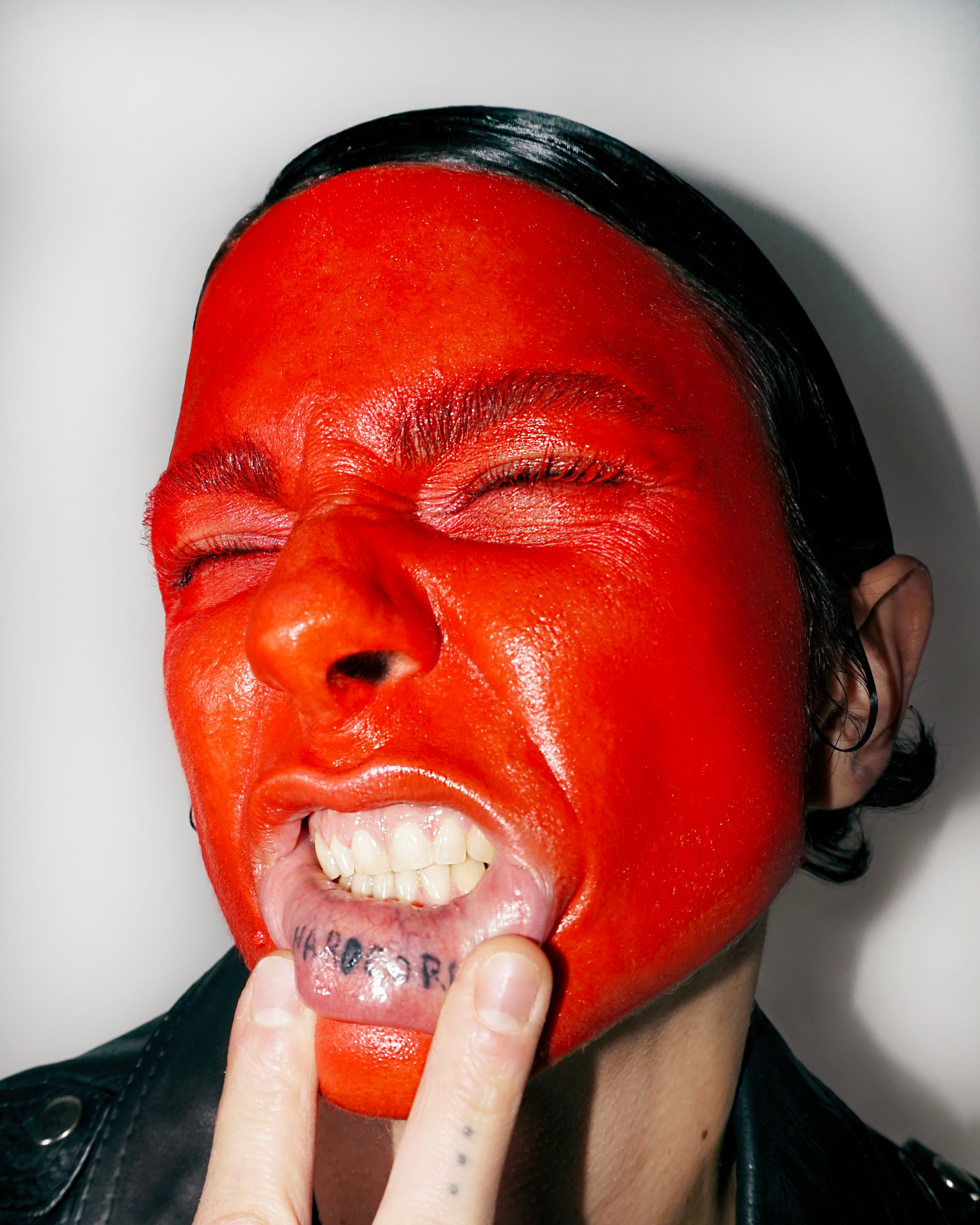
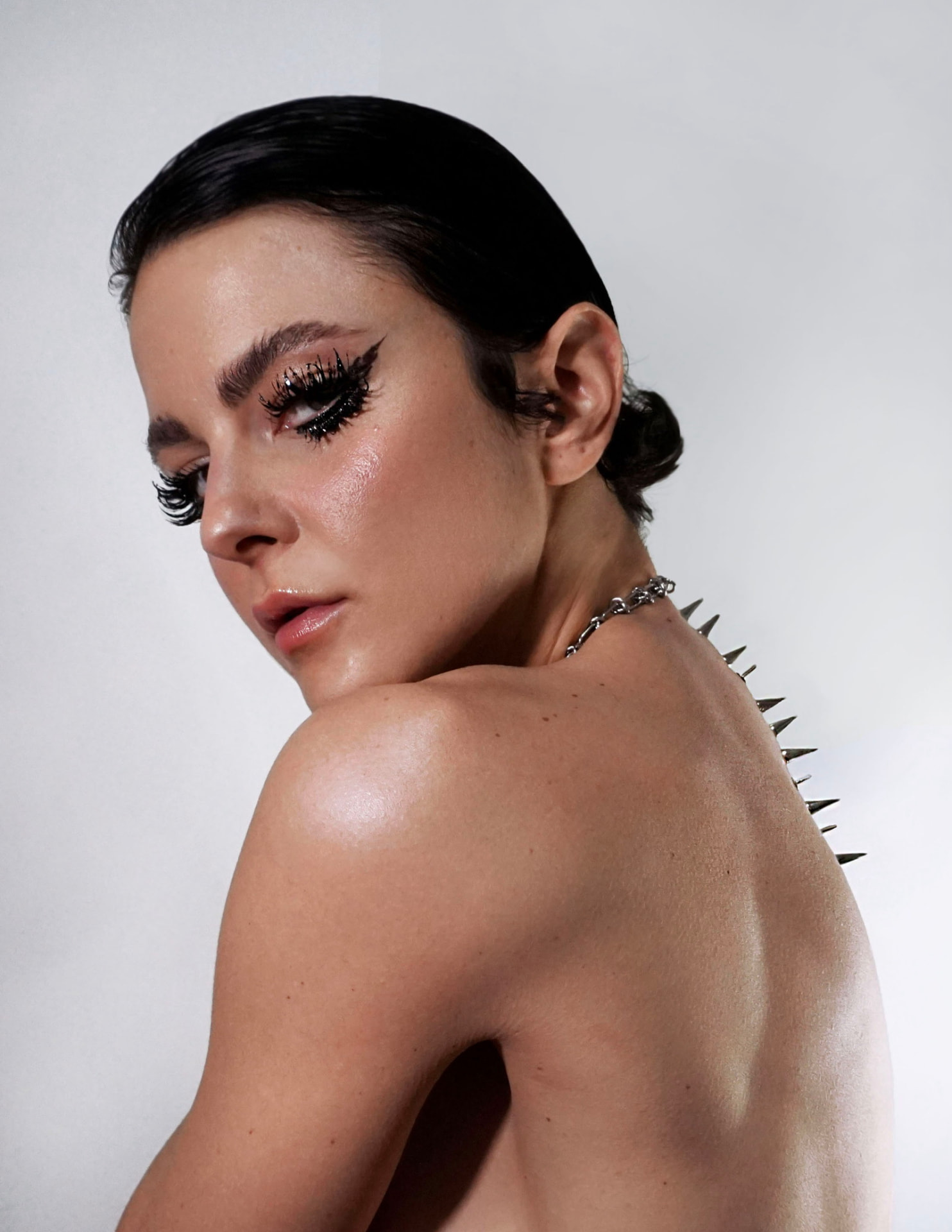
Red moves across makeup, skin, light and post-production until the distinction between colour and material begins to disappear. Beauty is used as part of the narrative rather than as an isolated look.
- Saturated red
- Glossy skin
- Hard flash
- Black leather
- Close framing
- Intentional visual disturbance
- Outcome
The shooting language and editing were developed to preserve technical precision while allowing tension and imperfection to remain visible.
A controlled visual world with an emotional edge: perfect enough to attract the eye, unstable enough to hold it.
Frames
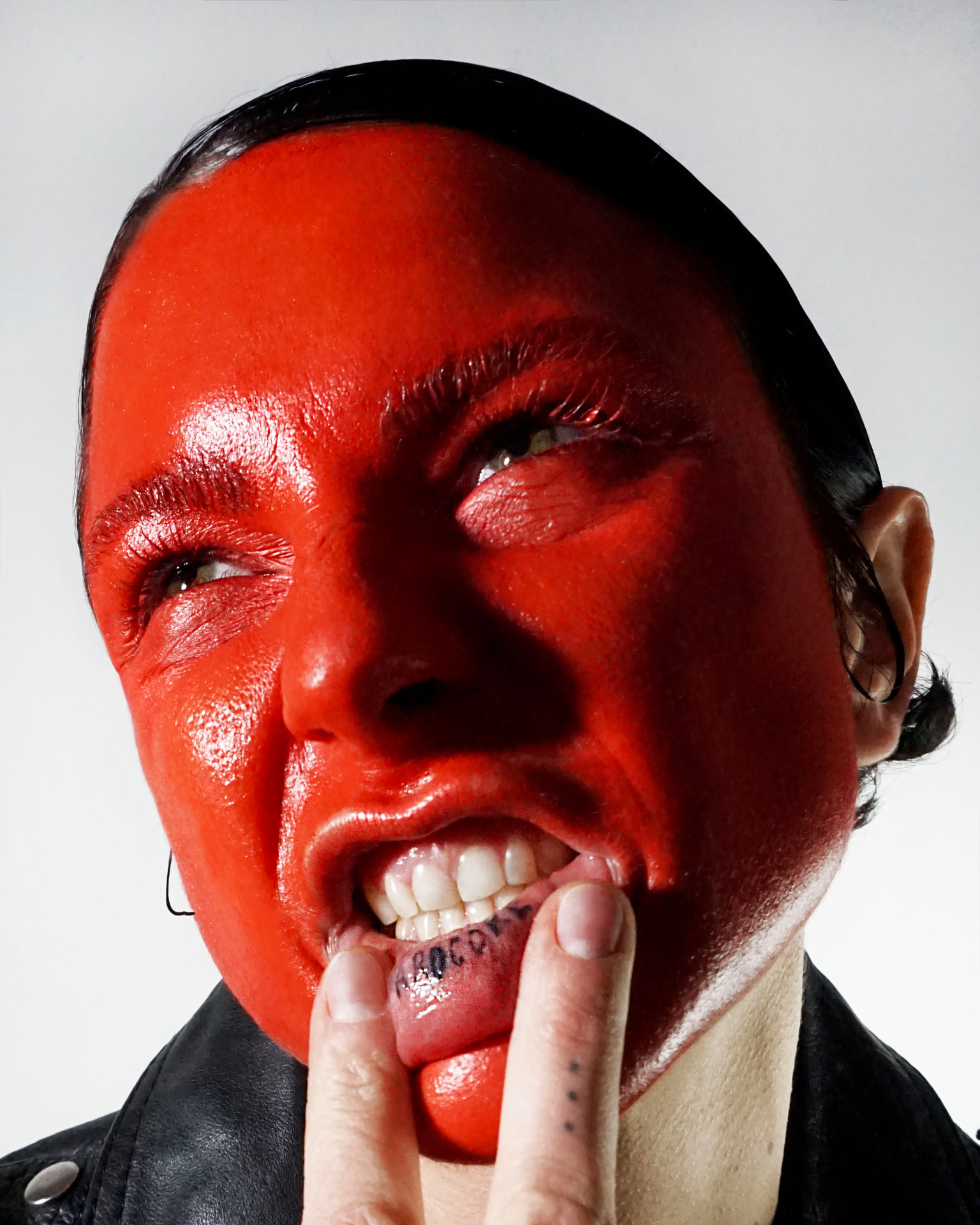
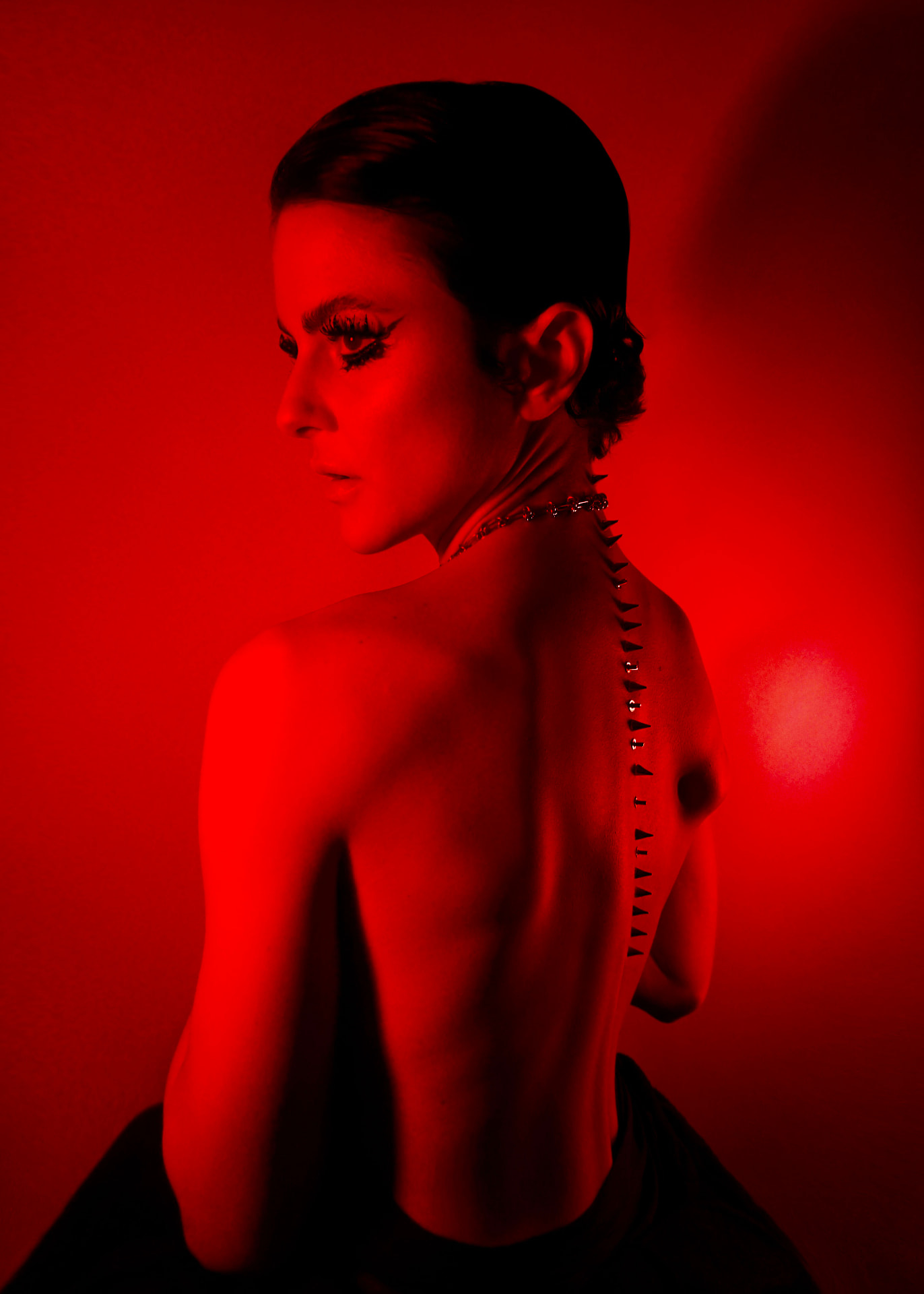
Swipe through the frames
Credits
- Creative Direction · Beauty · Photography · Retouch
- Sara De Blasi
- Studio
- Studio - working team
- Publication
- StyleCruze USA · Vol. 121
- Year
- 2026
Published editorial. StyleCruze USA is the publication, not a client — direction, beauty, hair, photography and retouch by Sara De Blasi.
Next case — 05
EMERGING BRAND IMAGE STRATEGY DIRECTION