EMERGING BRAND IMAGE STRATEGY DIRECTION
SHADOW. METAL. SKIN. WINE.
A dark, sculptural visual system built through shadow, reflective metal, skin sheen and wine-red depth — designed to move coherently across campaign, social and brand applications.
Visual StrategyColor DirectionCreative DirectionCase Study
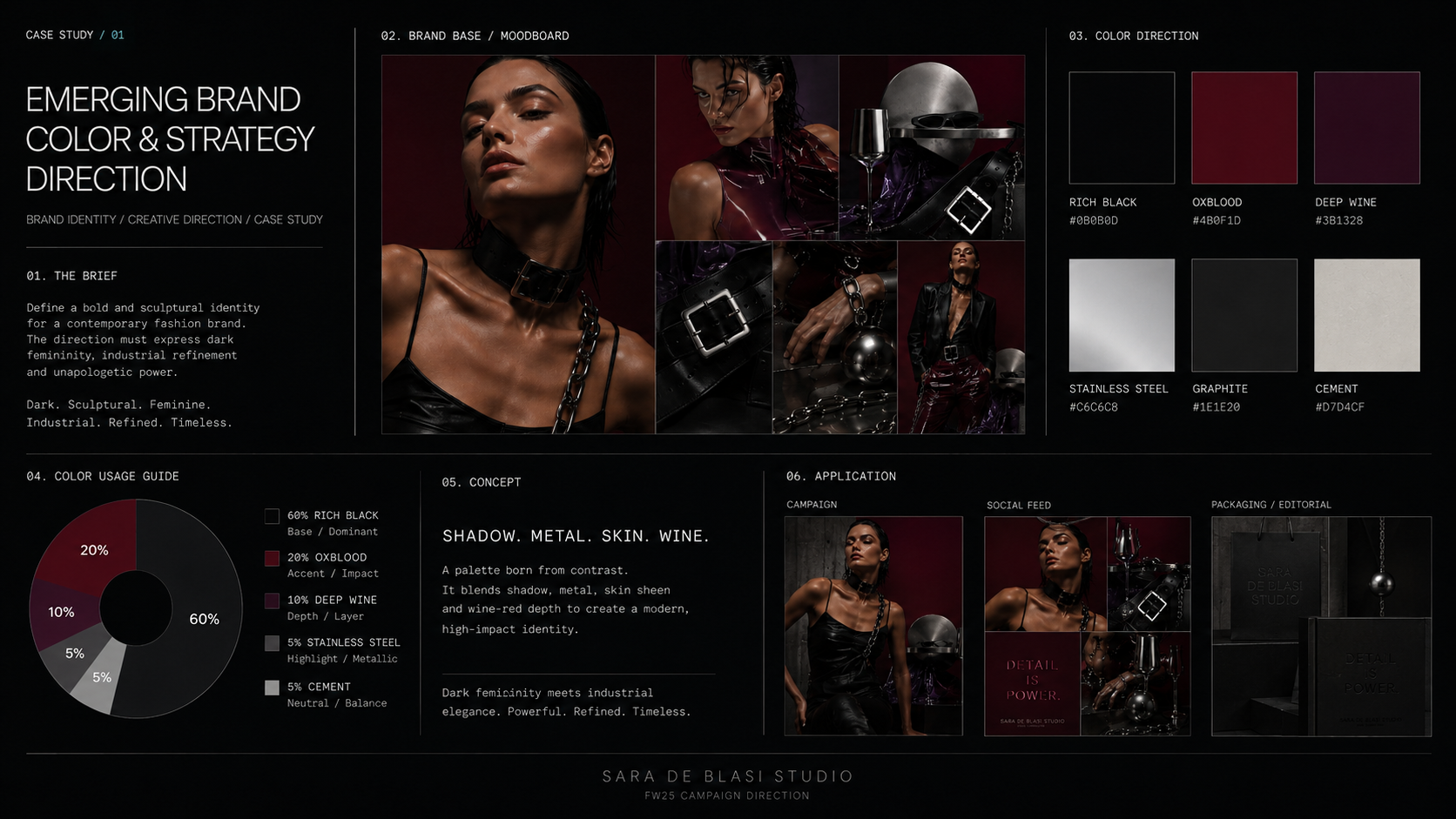
Palette read
- Rich Black #0B0B0D
- Oxblood #4B0F1D
- Deep Wine #3B1328
- Stainless Steel #C6C6C8
- Graphite #1E1E20
- Cement #D7D4CF
The Case
- Context
An emerging fashion identity needs a visual language that feels dark, contemporary and premium without falling into generic luxury codes.
Dark femininity meets industrial elegance. Strength and sensuality coexist through material contrast, controlled light and a deep chromatic system.
- Direction
Rich black carries the structure. Oxblood creates impact. Deep wine adds depth. Stainless steel, graphite and cement introduce a cold industrial tension against glossy skin and reflective surfaces.
- 60% Rich Black — base / dominant
- 20% Oxblood — accent / impact
- 10% Deep Wine — depth / layer
- 5% Stainless Steel + 5% Cement — metallic highlight / neutral balance
- Leather, stainless steel, PVC / vinyl and concrete define the material language
- Campaign, social feed and packaging / editorial are directed as one visual system
- Outcome
The board translates the strategy into campaign imagery, social-feed rhythm, packaging/editorial applications and shooting direction: hard directional light, material contrast, specular reflections and sculptural compositions.
A coherent visual language that demonstrates how the identity can scale across brand touchpoints while remaining recognisable, controlled and distinctive.
Frames
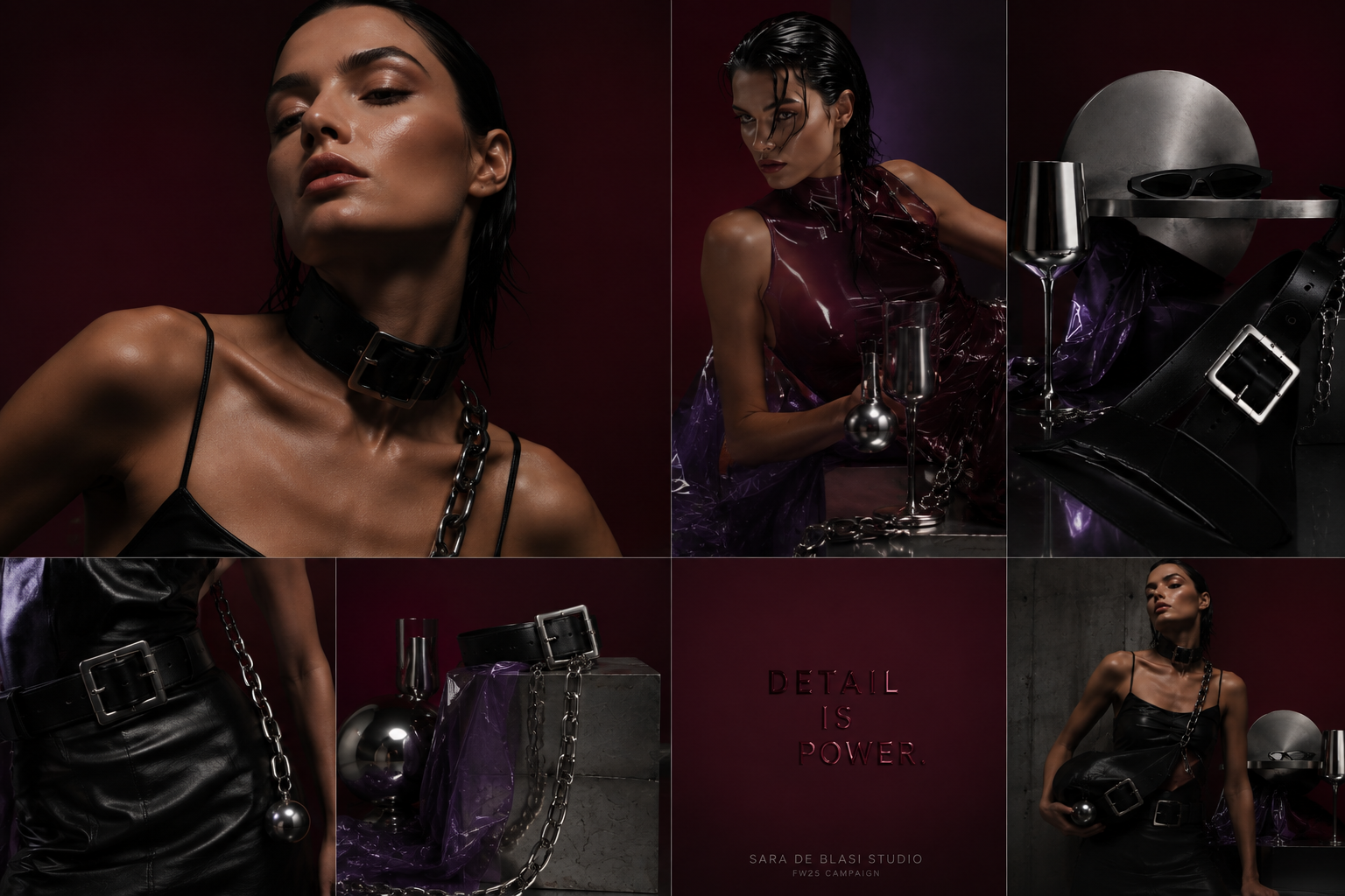
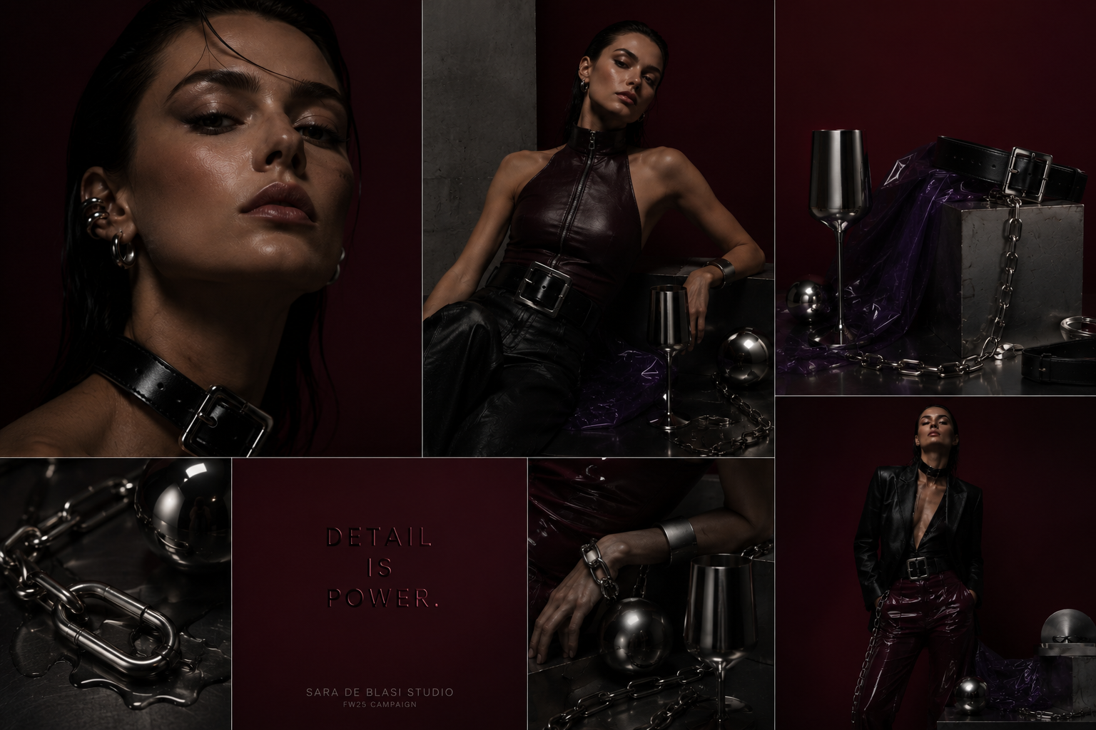
Swipe through the frames
Credits
- Visual Strategy · Color Direction · Creative Direction
- Sara De Blasi
- Year
- Case Study
Studio-developed conceptual brand direction case study. Not client work.
Studio-developed brand direction case study. Not client work.
Next case — 06
BLACKHOLE